About the Project
The Meters of Greek Drama database is an ongoing project of the John and Penelope Biggs Department of Classics and the Humanities Digital Workshop (HDW) at Washington University in St. Louis, aiming to compile metrical information in a growing list of ancient Greek tragedies, to empower an audience of students, scholars, dramaturgs, and performers to read the plays with scansion and discover and study metrical patterns more easily.
The Team
Principal Investigator: Timothy Moore, Washington University in St. Louis
HDW Staff: Douglas Knox, Stephen Pentecost, and Tumaini Ussiri
Arts & Sciences IT at Washington University in St. Louis: Gregory Porter
HDW Student Fellows and Other Student Assistants, Washington University in St. Louis: Jacqueline Baik, Ariadne Bazigos, Emma Bunde, Zixing Chen, Max Coady, Jordan Coley, Will Corbin, Shangwei Deng, Shawn Duan, Lucas Dube, Emelyn Hatch, Irene Herrmann, Bayla Kamens, Petey Kraemer, Lydia McKelvie, Jennifer McLish, Ian McNeely, Zakery Oglesby, Henry Schott, Elena Steiert, Di Wang, Rebecca Weingart, and Tom Van Denburgh.
Consultants: Anna Conser, University of Cincinnati; Rebecca Levin, Washington University in St. Louis
How to Use the Database
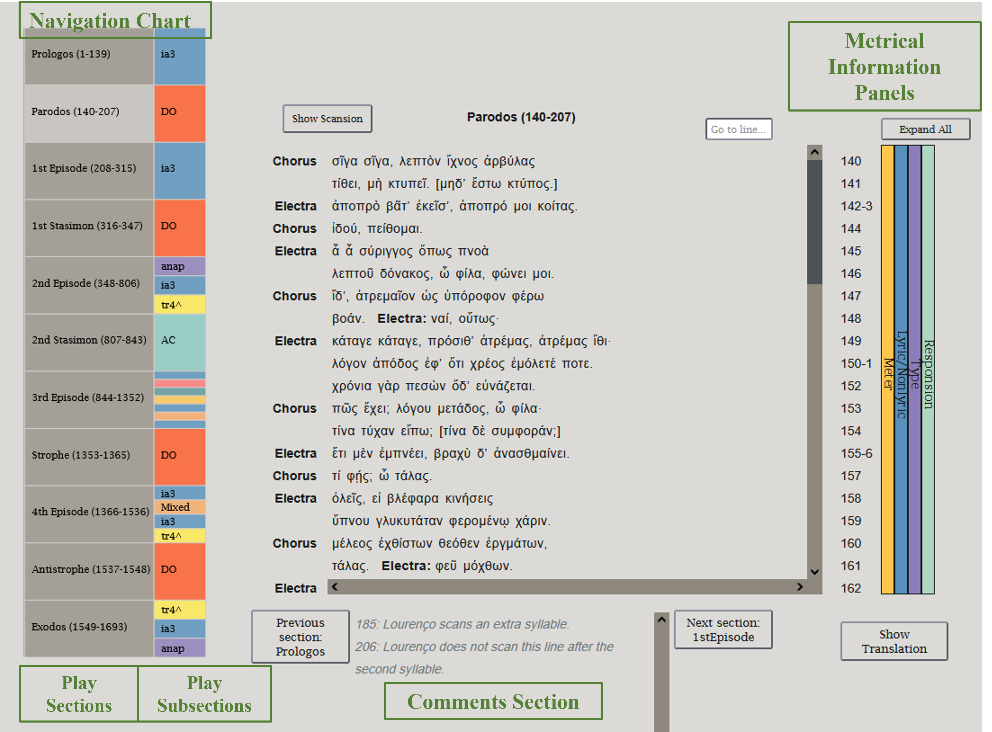
-
Navigation Grid
Clicking on any of the play sections on the navigation grid will load that section onto the body of the interface. That play section will also expand so that its multicolored subsections can be more clearly seen. Clicking on it again will shrink the navigation grid back to its original state.
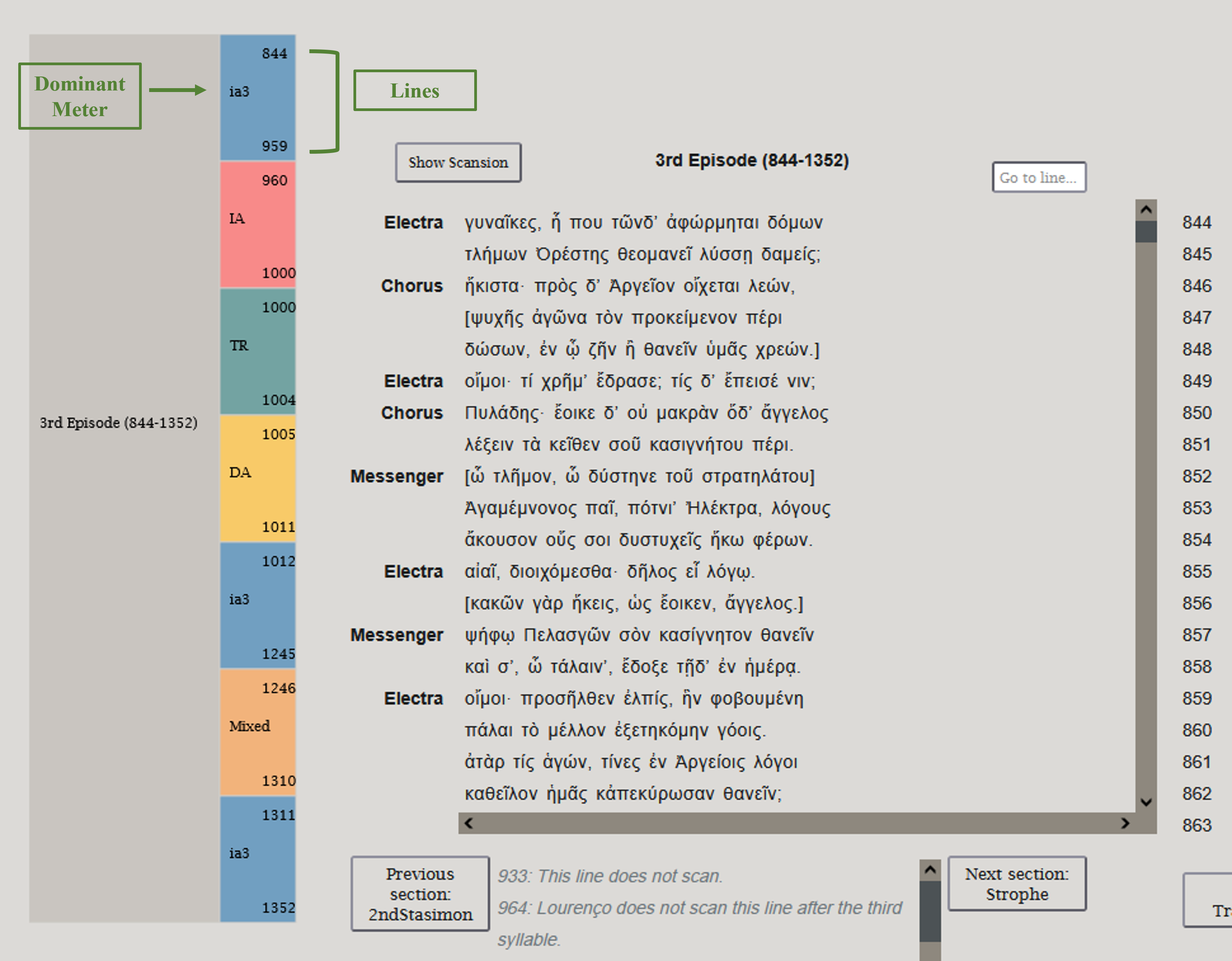
An expanded view of the navigation chart. The play section is further divided into play subsections, represented by multicolored boxes, on the basis of changes in meter or type of meter. Clicking on a play subsection will lead to that portion of the text, which will be highlighted in grey.
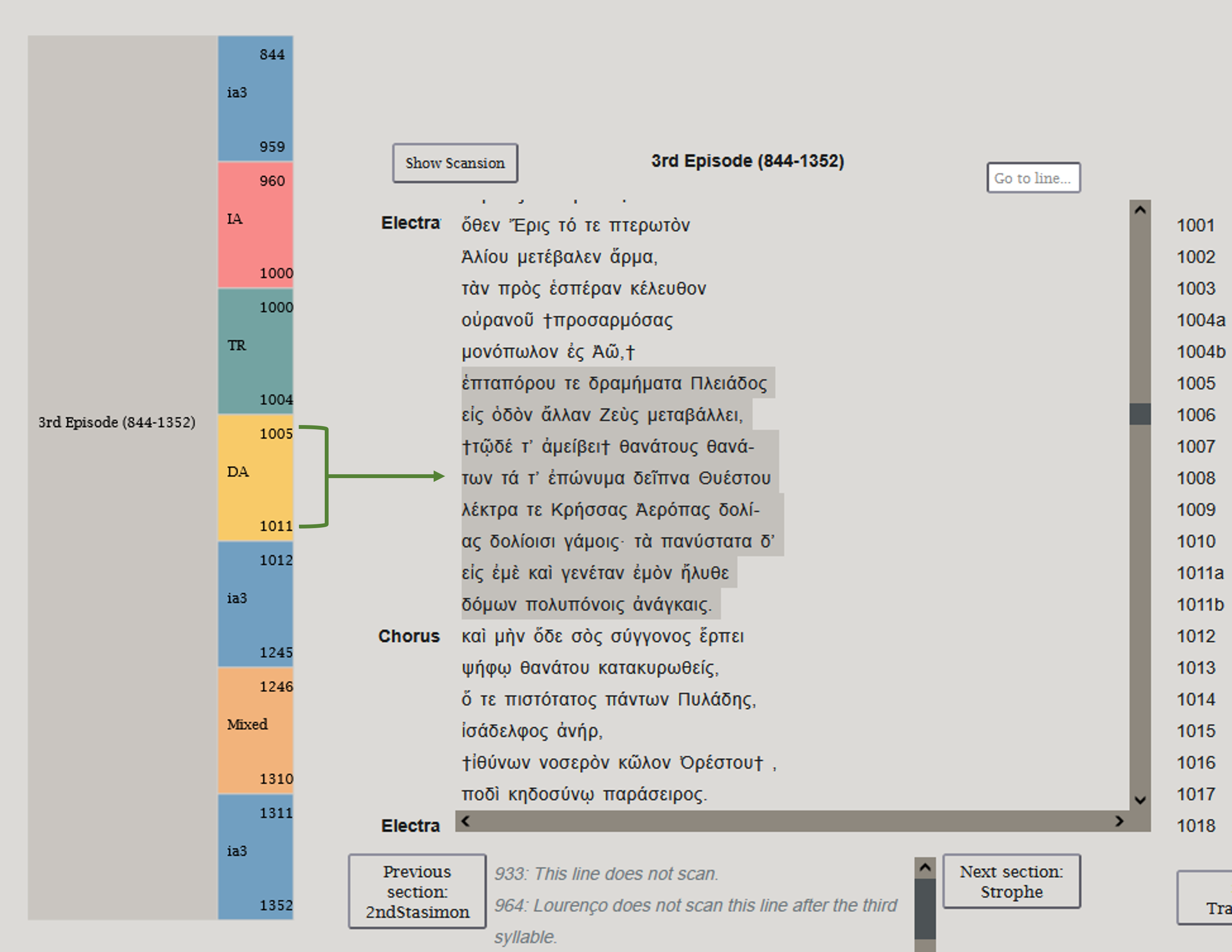
Metrical subsections of the navigational chart. Note: Heftier sections of the play may take a while (three to five seconds) to load.
-
Scansion
To display the scansion of the text, click the button titled "Show Scansion". On the top of each syllable will appear a scansion symbol marking it as long (-), short (∪), or "brevis in longo" (∩) in length. Symbols indicating metra (|), ends of periods (||), synapheia (∫), and caesurae (//) will occasionally appear as well. To hide the scansion, click the same button, now titled "Hide Scansion".
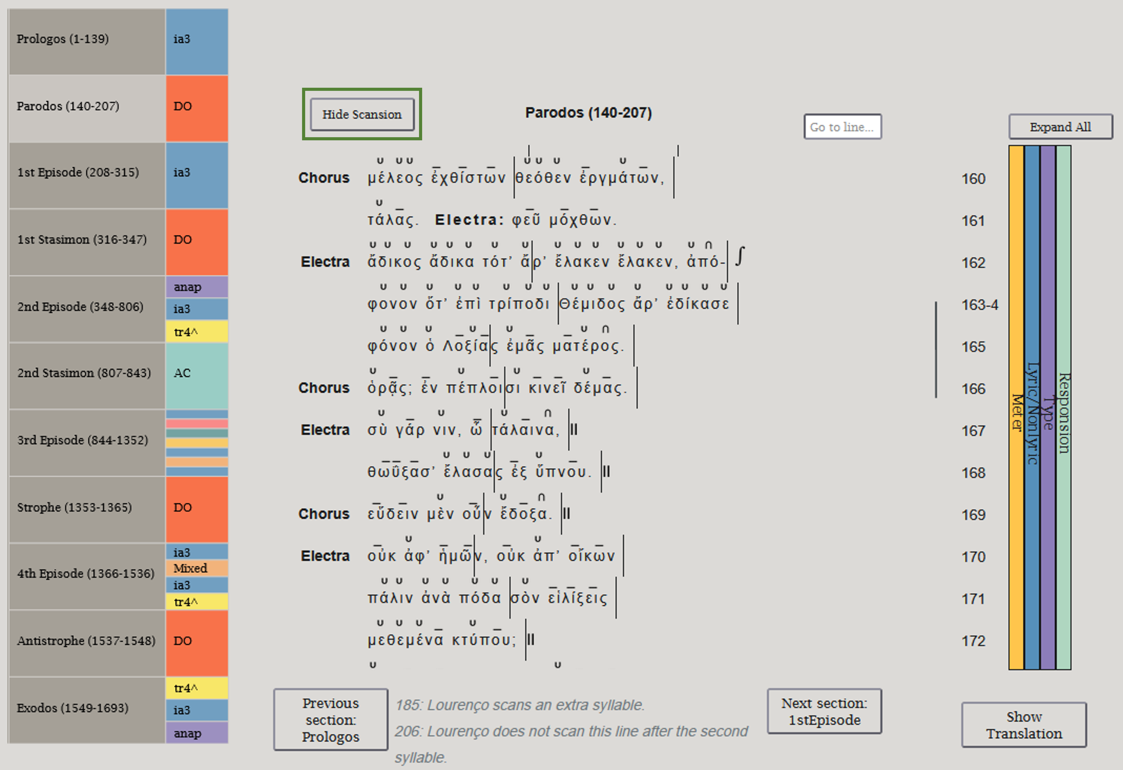
Appearance of scansion in the database.
-
Text Display and Navigation
In addition to navigating with the grid, you can move through the text using the buttons below the text box.
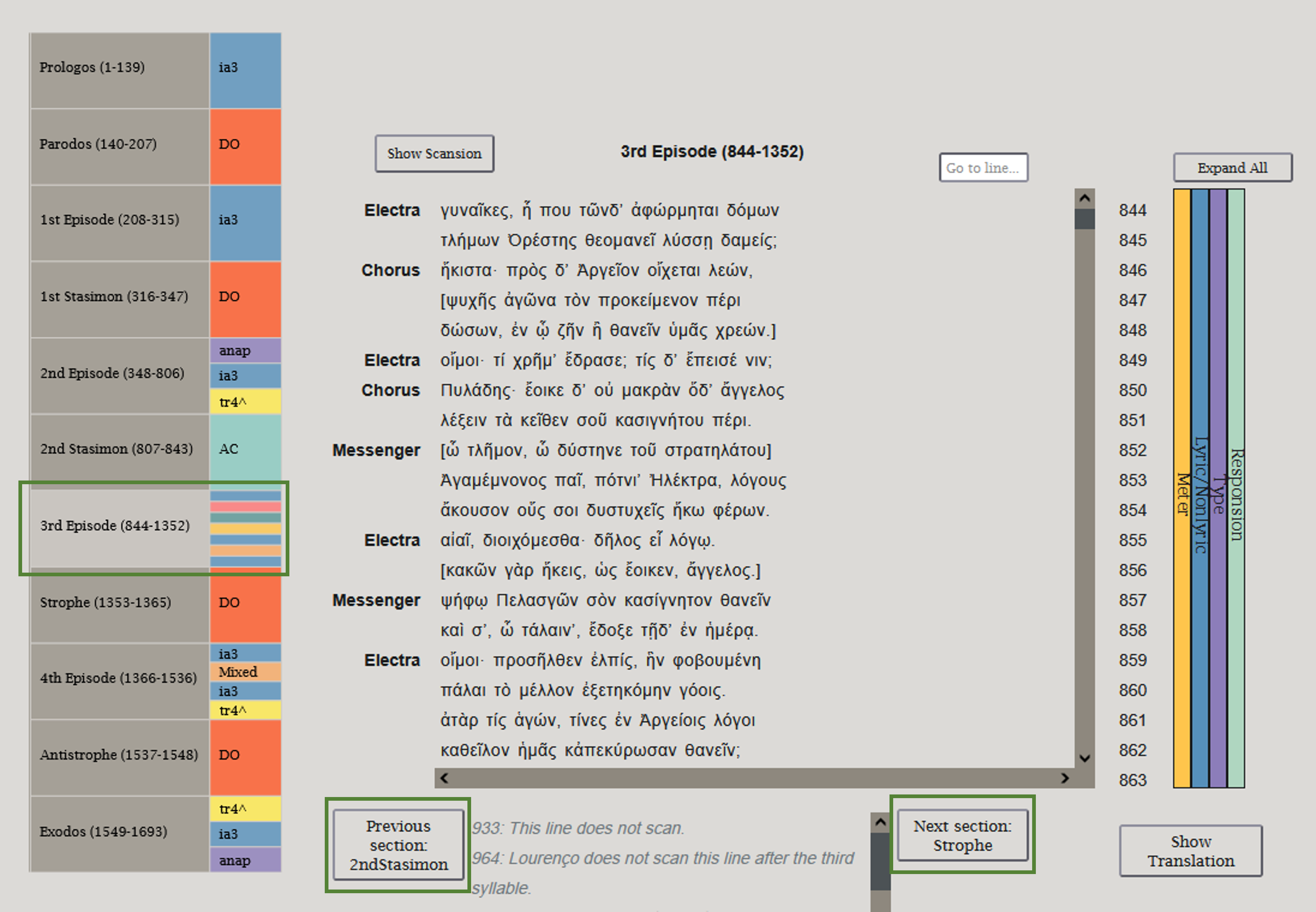
Database navigation options.
-
Metrical Information Panels
The panels to the side of the text box contain metrical information about each line of the text. Clicking one of the panels will expand or hide it. Clicking on "Expand All" will expand all of the panels at once; clicking "Collapse All" will collapse all the side panels. Individual panels can still be expanded and collapsed after clicking "Expand All".
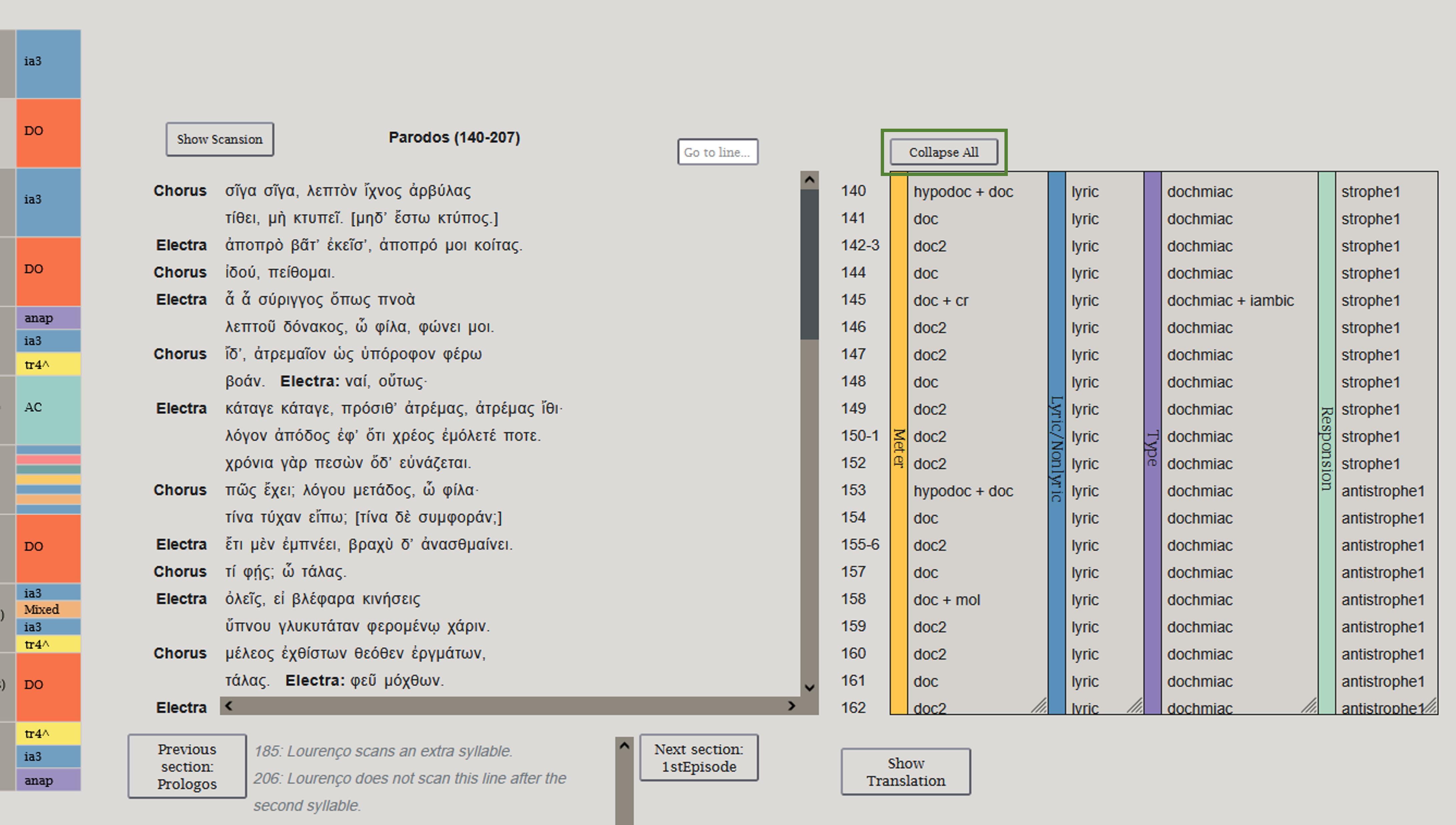
An expanded view of the metrical information panels.
Play sections display the Responsion panel if they have responding stanzas. Clicking any of the 'strophe' labels in the Responsion panel will highlight in teal-green the line and the corresponding line in the antistrophe—and vice versa for the 'antistrophe' labels.
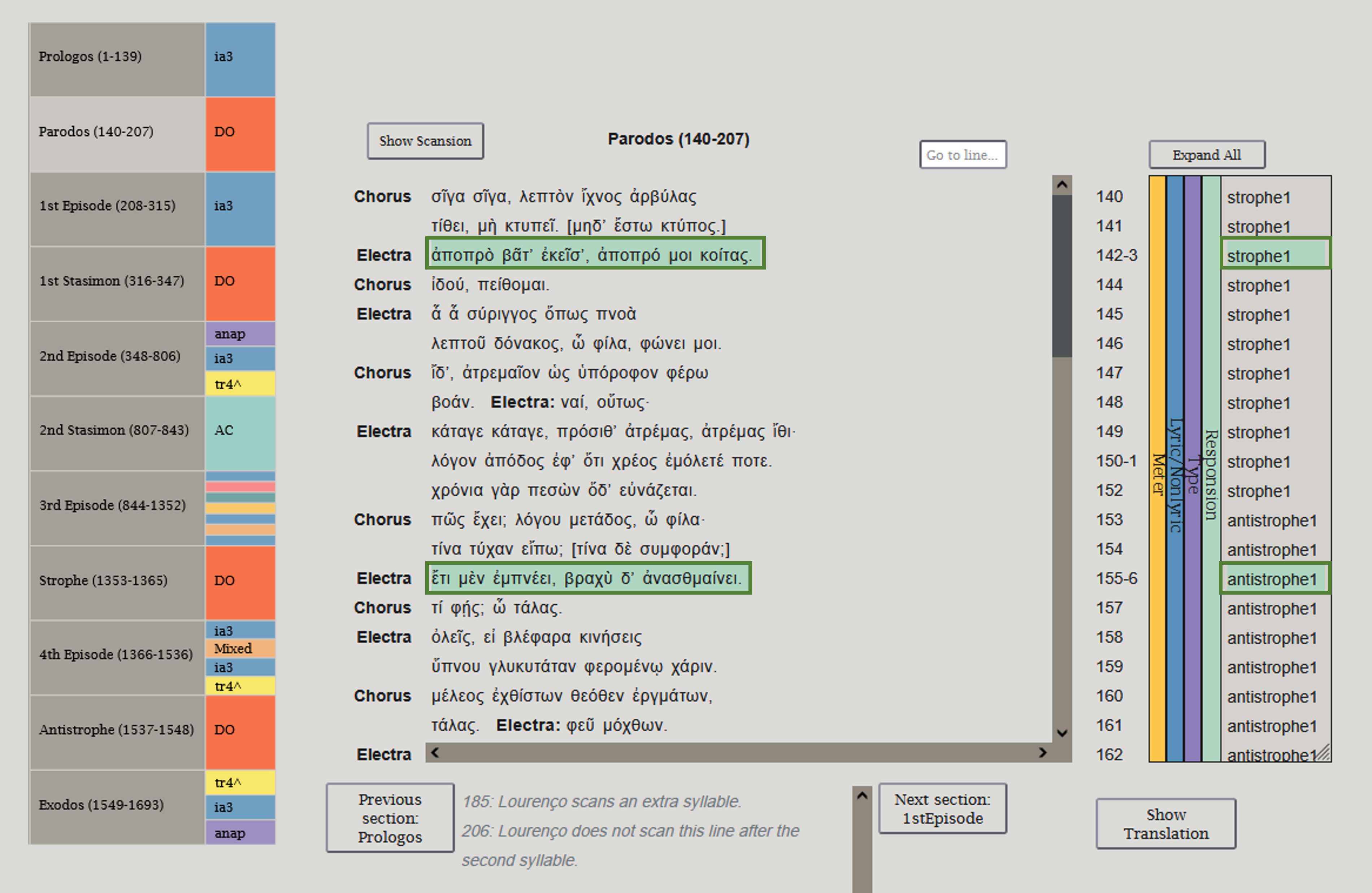
Responsion click-to-highlight detail.
-
Search
The box labelled "Go to line..." allows access to any line in the play. Click on it, enter a valid line number, and hit Enter or Return. The text box will switch to the section that contains the line and jump down to that line. The line will also be highlighted.
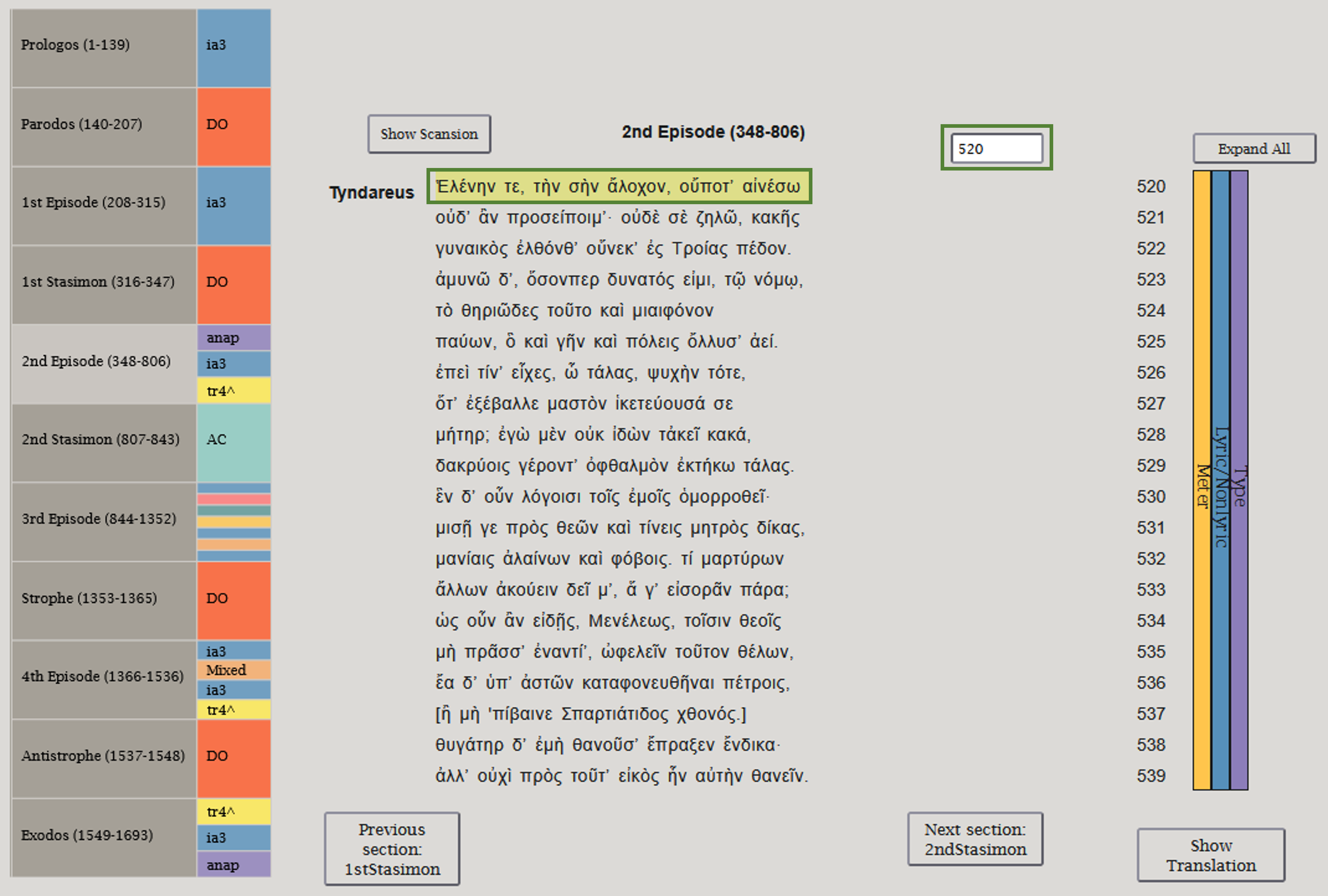
Results of searching for line 520 in Orestes.
-
Translations
Translations can be toggled by clicking the "Show Translation" button underneath the metrical information panels. Every fifth line of the play is marked in square brackets in the translation. Entering a line number in the "Go to line" box when the translation is displayed will jump the translation to the closest fifth line before it.
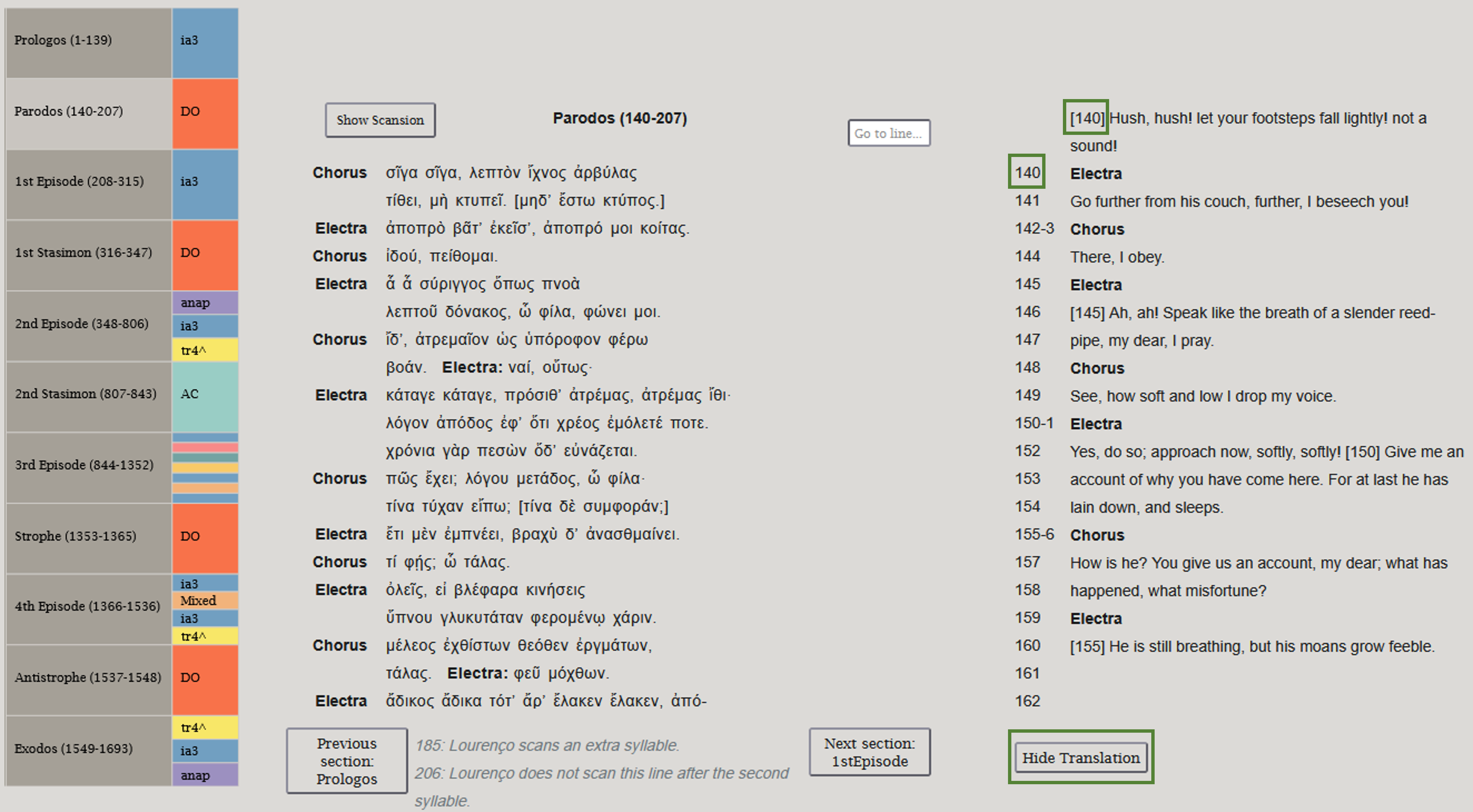
An image of the database with the translation showing.
-
Comments
Comments will occasionally appear in grey italics below the text in a comments section. For play sections with many comments, the comments section may be scrollable.
How to Use the Filters and Statistics Page

-
The Filters Box
When first entering the Filters and Statistics page, no filters will be active. Every line (or word or syllable) from every play represented in the database will be counted towards the statistics. Selecting one or more filters from the Filters box and then clicking the "Apply Filters" button at the bottom of the page will update the statistics according to the selected filters.
-
Metrical Patterns
At the top of the filters box is the section entitled "Metrical Pattern", whose buttons you can click to type out a particular scansion to filter for. The markings are long (-), short (∪), short or long (⏓), two shorts or a long (⏕), and "brevis in longo" (∩).
Notes:
- The ∪ marking does not include brevis in longo.
- The ⏓ marking will filter for any short syllable, long syllable, or brevis in longo (not two short syllables). It is not dependent upon metrical position.
- The ⏕ marking will filter for any long syllable or two consecutive short syllables. It is not dependent upon metrical position.
You can use any valid "regular expression" (or "regex") for more complex searches by typing the regex in the search box along with your selected metrical pattern. The following are some of the more useful regex expressions for this context:
Symbol Meaning Example Explanation ^ Marks the start of the line/word ^- Returns every line/word that starts with a long syllable $ Marks the end of the line/word ∪$ Returns every line/word that ends with a short syllable (not including breves in longo) | When used inside parentheses, creates an EITHER/OR search on either side of the vertical line (pipe). Definite pattern elements can be added outside the parentheses. (∪∪∪|-)- Returns every line/word that contains either three shorts or a long and then a subsequent long syllable The metrical pattern filter is available when quantifying data by lines or words; it is disabled when quantifying data by syllables.
-
The Rest of the Filters Box
Basic instructions on how to select and deselect multiple filters are at the bottom of the left side of the Statistics page.
There are multiple dimensions of filtering possible, including, but not limited to, gender or line meter. All the individual filters within a specific dimension or characteristic are mutually exclusive — e.g., there can't be a line spoken by a simultaneously free and enslaved character, each line can only have one meter type, and so on.
There are "Select all" and "Deselect all" buttons as well as a search box above each filter other than the metrical pattern search. Additionally, you can order the contents of the filters either in alphabetical order or by the number of lines (or words or syllables) in that filter by clicking on the up/down arrows on the table headers.
Note that no selected filters and/or metrical searches will be reflected in the statistics box until the "Apply Filters" button at the bottom of the page is clicked.
-
The Statistics Box
The statistics box contains representations of the data filtered in the filters box. There are five tabs corresponding to these different representations.
-
Quantify Data By
You can choose the units of measurement that the website uses to tally the data by clicking any of the three options at the top of the page. Because lines can vary wildly by length, assigning each line the same statistical value may not be the most informative way to organize the data. Computing words and syllables, however, is significantly slower than tallying lines due to the increased precision of the measurement method.
-
Toggle Zeroes
You can use this button to make the filters and any of the statistical displays hide (or show) categories that are empty (count = 0) for the sake of visual clarity. This button does not affect the All Lines tab, which will always hide lines that are excluded by active filters.
-
All Lines
In this tab, you can scroll through the specific lines the filters have included (or the entire database, if no filters are currently active). You can click on the text to go to the corresponding line, which will be highlighted in yellow, on the database.

The All Lines tab with key buttons in boxes.
-
Data Chart
The data chart tabulates the lines (or words or syllables) along two characteristics or dimensions, as indicated by the dropdown menus on the top. To get the data in only one dimension, set the "Display Data By (Columns)" dropdown menu to "None" or match the top and bottom dropdown menus.
When the data chart is displaying two dimensions, the "Toggle Percentages" button will cycle through four different ways of tallying the data.
- The default state (zero clicks on the "Toggle Percentages" button) displays the raw numbers.
- The second state (one click on the "Toggle Percentages" button) calculates the percentage of the selected characteristics appearing in the filtered lines by taking each cell of data and dividing it by the total of that row. In other words, it calculates row percentages.
- The third state (two clicks on "Toggle Percentages") displays the percentage of each characteristic compared to the column, by taking each cell and dividing it by the total of that column. This displays column percentages.
- The fourth and final state (three clicks on "Toggle Percentages") takes each cell and divides it by the total of the entire chart — that is, the current total number of (filtered) lines or words or syllables. The percentage displayed represents the percentage at which the row and column characteristics appear in the selected filters.
For example, if one were to tally the number of lines by character gender and by play in three of Euripides' plays, the table would look something like the following:

A sample data chart comparing number of lines across play and character gender. Consider the top left cell, the intersection of the "female" and "Orestes" attributes.
- The default state shows that 611 lines are spoken by females in the play Orestes.
-
After pressing "Toggle Percentages," the second state is
displayed. The 611 lines originally in the cell is now
divided by the total in that row, 2194, to display 27.8%.
That is, 27.8% of all lines spoken by a female in any of
the selected plays are spoken in Orestes.

A sample data chart showing the effect of a single click on "Toggle Percentages". -
After pressing "Toggle Percentages" again, the third state
is displayed. The 611 lines originally in the cell is
divided by the total in that column, 1707, to display 35.8%.
That is, 35.8% of all lines in Orestes are spoken by a
female.

A sample data chart showing the result of clicking twice on "Toggle Percentages". -
After pressing "Toggle Percentages" a third time, the fourth
state is displayed. The 611 lines originally in the cell is
divided by the total in the entire chart — 4337 — to display
14.1%. That is, out of all the lines that are currently
being counted, 14.1% of them are spoken by a female in the
play Orestes.

A sample data chart showing the result of clicking three times on "Toggle Percentages".
Pressing "Toggle Percentages" again brings the table back to the default state. Tracking the location of the 100% percentages in the table can help remind you what is being calculated.
-
Visualizations - Bar, Pie, and Parallel Categories Charts
This section details the types of simple visual comparisons of data the website can generate; namely, bar charts, pie charts, and parallel categories charts. Each type of chart also has buttons that allow you to interact with the visualizations of the data.
The bar chart can be adjusted to show counts of the filtered lines (or words or syllables), sorted by line meter, meter type, play, part of play, character, character gender, character enslavement status, character divinity status, character Greek status, or line lyric status.

A sample bar chart with the menu options showing. The pie chart shows relative percentages of the filtered lines (or words or syllables), and can be adjusted along the same dimensions as the bar chart by using the "Display Data By:" menu.

A sample pie chart. The parallel categories chart displays simultaneously the many dimensions or characteristics into which the data are categorized. The label at the top of the vertical dark blue bars shows the dimension or characteristic in question, while the specific value of that dimension is labeled next to the bar. For example, the dimension of "gender" has two smaller bars, one for the "male" and "female" speakers of lines (or words or syllables). The characteristic "line meter type" will have as many possible values as there are meter types, but only those present in the filtered section of the database will be shown. All the possible dimensions and values are derived from the filters box; the parallel categories chart allows you to see a visual representation of all the characteristics a group of lines (or words or syllables) possesses.
Below is a simplified example of how the parallel categories chart functions.

A sample parallel categories chart showing multiple dimensions of female-spoken lines. This chart is a visualization of the lines spoken by enslaved female characters in the 3rd stasimon of Euripides' Hekabe. You can also select entire plays, or characters within plays or sections. In this case, all these lines are delivered by the chorus, so the dimensions of gender, enslavement status, divinity, and Greekness all have a single value - the lines are all spoken by enslaved human nonGreek women. The lyric value of their lines is always lyric, and then the chart breaks down the different meter types by creating different labeled sections. Line counts for all dimensions can be found in the filters box.
A more complex example of a parallel category chart is below.

A sample parallel categories chart showing multiple dimensions of lines spoken by multiple characters. In the image above, the chart is displaying the characteristics found of lines spoken by all characters in the third episode of Hekabe. While Hekabe the character speaks all her lines in this section (nonlyric iambs), there is a shift on the part of the Chorus, who now sing in lyric iambs. This has interpretable meaning for the action of the play. Additionally, below the breakdown of lines spoken by female characters is a section for male-spoken lines. Since Agamemnon is a free Greek, his lines also have different values from the other characters in the enslavement status and Greekness dimensions, though he shares the nonlyric and iambic values with Hekabe's lines.
The dimensions relevant to this project are demographic: gender, enslavement status, divine status, and Greekness. Each of these categories impacts the type of meter a character will use.
For a brief explanation of parallel category charts, including examples, see the information on the Sources and Additional Resources page.
If the chart looks odd, try increasing the vertical size of the window.
Remember that you can set filters in the Filters Box, which will change the data presented in the chart in accordance with the filters. You must click "Apply Filters" after every change you make in order to see that change represented in the visualizations.
The interactive buttons shared by all three visualizations are explained in this section; buttons unique to a visualization are explained in a separate drop-down item. For any of the visualization types, hovering the cursor to the right and above the chart title will reveal these buttons.
Download PNG: clicking on the camera icon will download the visible range of the chart into a .PNG file. If you have adjusted the visual range of the chart from the default, the .PNG file will reflect this.

The pie chart's interactive button options, with the camera icon highlighted. Plotly: the rightmost icon is a link to the Plotly homepage, if you are interested in learning more about the tools used on the filters and statistics page. Clicking the icon will open the Plotly homepage in a new tab.
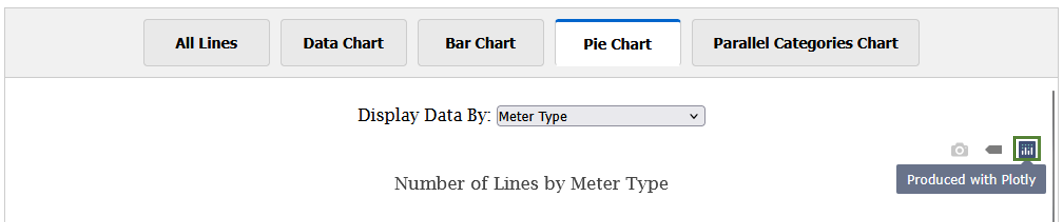
The pie chart's interactive button options, with the Plotly icon highlighted. Data Labels: the grey bar controls the data labels, which provide additional information for highlighted data. While the bar, pie, and parallel categories charts each have data labels, they function slightly differently depending on the chart type.
The bar chart has two options for data labels, each with their own button. The default is the two stacked horizontal bars. When this button is active, as long as your cursor is in the vertical range of a bar of data, the label and precise value of the bar will appear.

The bar chart showing the label and value of a bar of data with the cursor (a small green arrow) above the bar. The second option is activated by clicking the single horizontal bar. Once your cursor is hovering on the data of a particular bar on the chart, the bar label and value will be shown in a floating box. The cursor must be touching the data for this visualization to activate; zooming may be necessary to use this function on bars with small values.

The bar chart with a single bar's value shown while the cursor (a small green arrow) is touching it. For the pie chart, hovering labeled data counts (raw and percentage) are automatically enabled. If you want to turn them off, click the single bar to the right of the camera icon.

The pie chart's interactive button options, with the data label icon highlighted and a data label showing. The data labels for the parallel category chart are always active, but provide different information depending on cursor placement. Hovering your cursor along a vertical bar will display the raw and percentage data of each dimension of that characteristic (i.e. “isGod” will display line counts for “human” and “god”). Hovering the cursor over a horizontal data band will display the line count and percentage for speakers who have each of the shown dimensions (e.g. for “female”, “free”, “human”, “Greek”, “nonlyric”, and “iambic”).

A parallel categories chart, with the data label icon highlighted and a vertical dimension label showing. A parallel categories chart, with the data label icon highlighted and a horizontal band label showing.
-
Additional Visualization Buttons - Bar Chart
Zoom: the magnifying glass is a zoom feature. It is selected by default. To use it, click and drag to create a box around the area you wish to magnify. The zoom will occur once you release the click.

A bar chart displaying line count by meter type, with the zoom icon highlighted. 
A bar chart displaying line count by meter type, with a box drawn over the area to be zoomed in. 
The bar chart displaying the zoomed-in section of line count by meter type. Pan: clicking on the "pan" button will allow you to then click and drag the chart to adjust the viewscreen. If you switch to the pan tool after using the zoom feature, you can still drag "off-screen" sections of the data into view.

The bar chart with the pan button highlighted. Simple Zoom: the boxes containing a plus and minus symbols are simple zoom features. Clicking the box with the additional sign will zoom the visualization in, pulling the view closer to the center of the current display. Clicking the button with the subtraction sign will zoom out, again from the center of the current visualization display.

The bar chart with the zoom in button highlighted. 
The bar chart with the zoom out button highlighted. Autoscale: the button with the diagonally-oriented arrows is the autoscale button. This button resets all adjustments to the display of the visualization, resetting it to the default view.

The bar chart with the autoscale button highlighted.
Intended Audiences
This project envisions three general categories of user: scholars interested in the meter and music of Greek dramatic plays; playwrights or performers wishing to stage performances or look for deeper understanding of character; and students of all levels of exposure to Classical drama who are looking to engage further with the texts.
 This database is made available under a Creative Commons
Attribution-Share Alike License.
This database is made available under a Creative Commons
Attribution-Share Alike License.